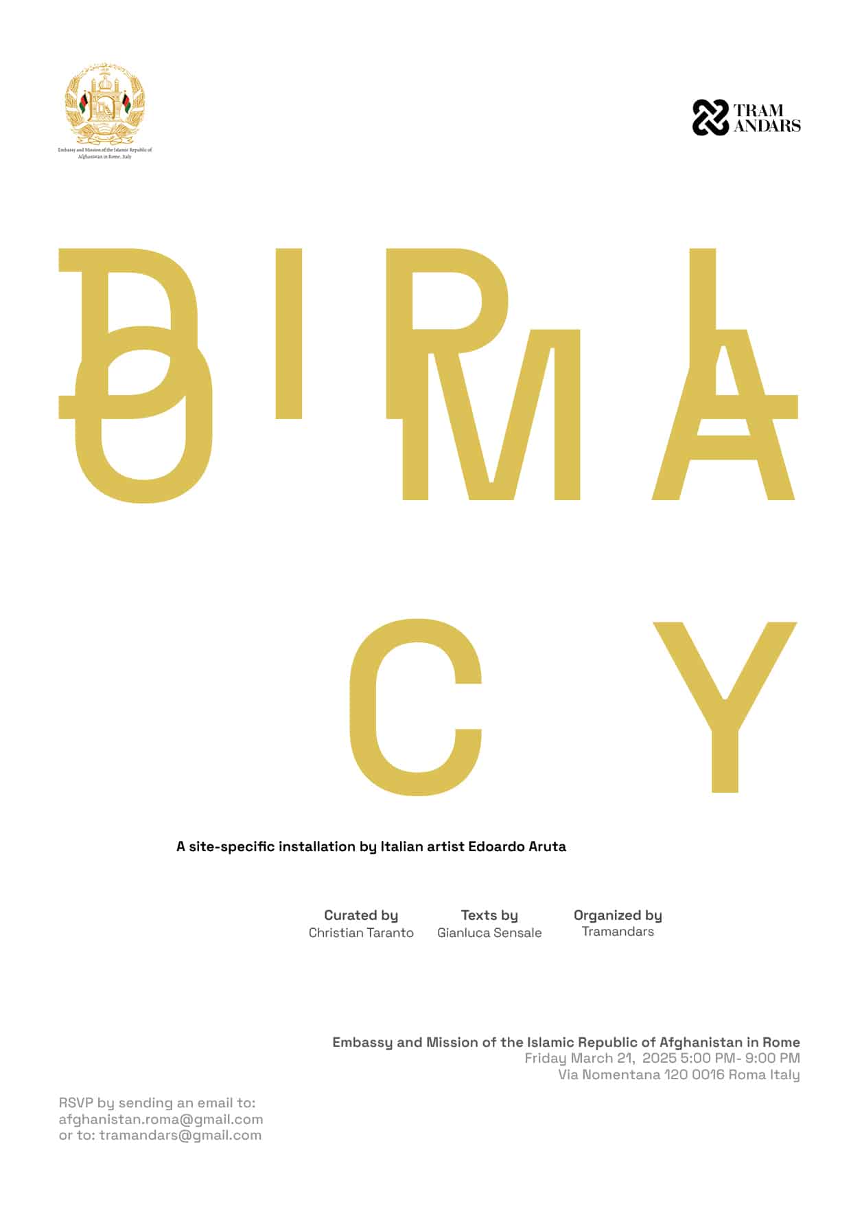
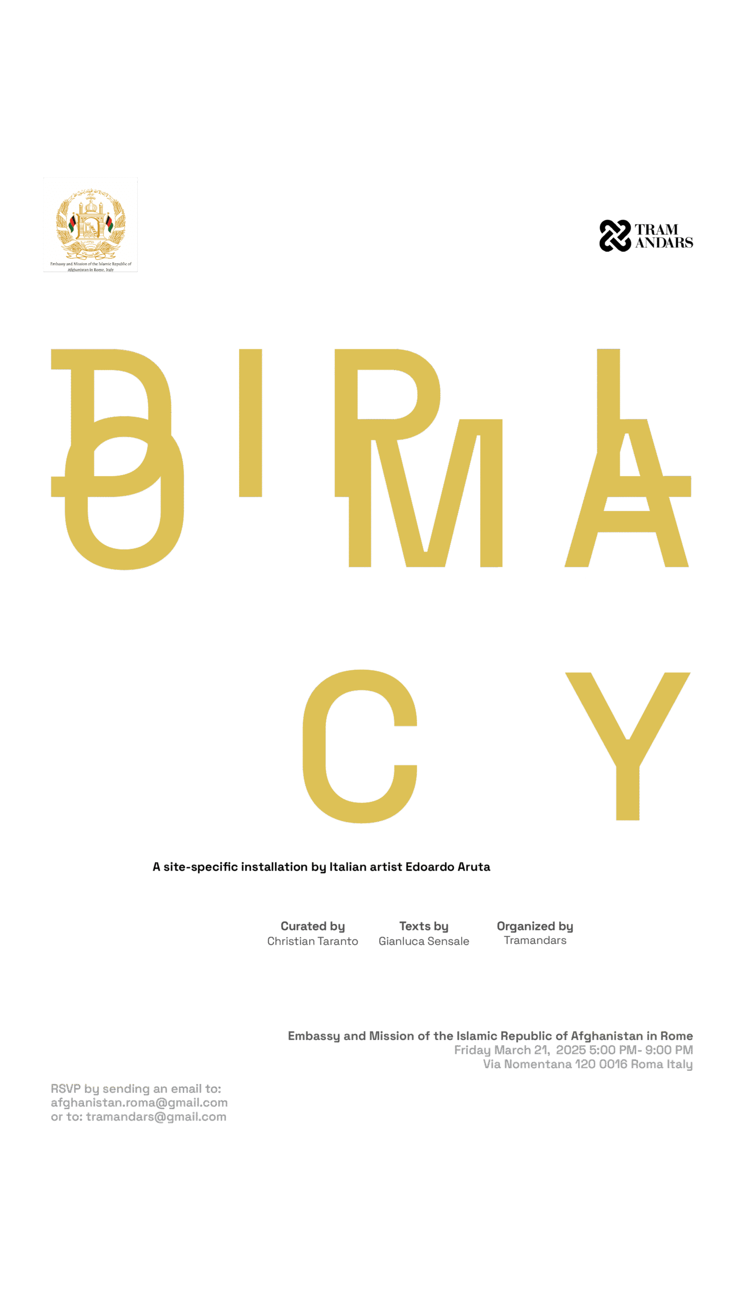
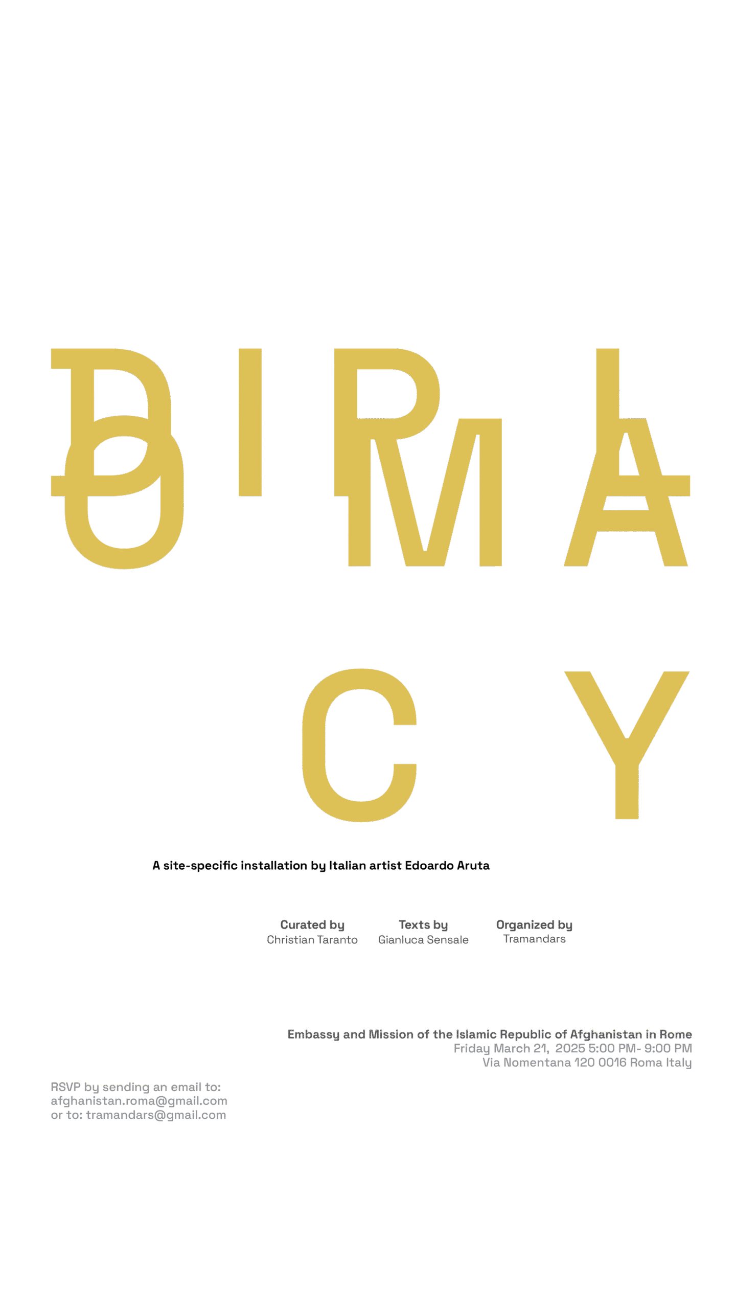
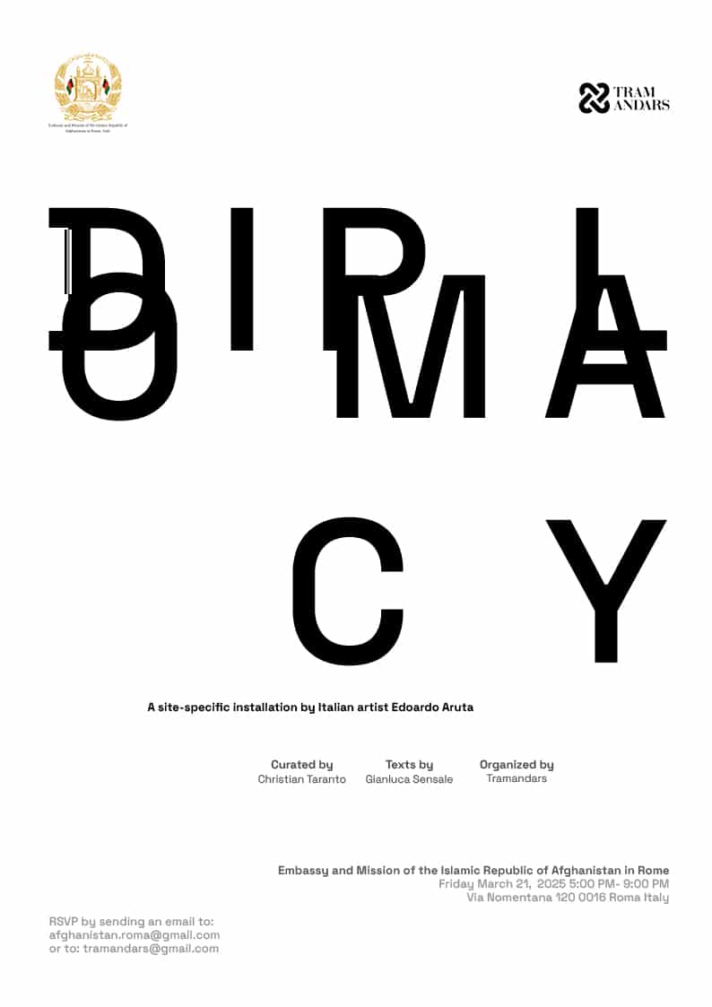
Diplomacy
Diplomacy

Art Direction & Graphic Design Scope


I developed a full suite of visual and communication assets for the exhibition, including: main Exhibition Poster (Digital & Print). A conceptual composition using Space Grotesk and a customised overlapping structure of the word DIPLOMACY, symbolising conflict, convergence, and deferral. Bilingual Exhibition Handout (IT/EN). Designed for both A4 reading format and an A3 print version—with one side featuring curatorial texts and exhibition information, and the reverse side showing a large-scale photographic image from the installation, designed to be taken away by visitors as a gift print. Instagram Story Set. Custom-designed story templates and animated transitions echo the same typographic tension used in print.

Diplomacy
Diplomacy
Diplomacy
Diplomacy
Diplomacy
Diplomacy
Diplomacy

Colour & Symbolic Language


The visual identity centres on a specific yellow tone, inspired by a painting from Alnasan’s solo show at the World Intellectual Property Organization (WIPO) in Geneva. In that context, yellow was used to signify human spiritual energy and warmth within virtual diplomatic spaces. Here, it becomes a marker of presence, fragility, and vitality—an ideal counterpart to the institutional black and white typographic structure.

Diplomacy
Diplomacy
Diplomacy
Diplomacy
Diplomacy

Reflections on Process

This project exemplifies how graphic design can operate critically and poetically within an exhibition context. As both designer and photographer, I worked to develop a coherent atmosphere across media: visual identity, layout, and materiality were all aligned to extend the exhibition’s curatorial narrative.


@